Examples of Diane's Dashboards
The following dashboards are part of a family of core network reports aimed at providing insights on traffic volumes and subsequent resource requirements. The context is a service provider network with millions of users and a mix of all types of internet traffic. The network has hundreds of links with varied capacities, from multiple 10Gs for smaller hubsites to tens of 100Gs for backbone links. Link costs are also varied as some are on the service provider’s own fiber infrastructure while others are leases from other providers. Initial data sources are Network Management Systems (NMS) collecting 5-min traffic measurements from network routers and dumping them into a datalake. An ETL workflow is scheduled to differentiate and aggregate traffic traces on a daily, weekly, and monthly basis. Those are the data feeding the BI tool for use in dashboards.
Toolkit: (NMS) API, Python, SQL and key-value NoSQL, AWS cloud computing, Alteryx, SnowFlake, Tableau
Ex 1. Realtime Traffic Map
Some visualizations are simply traffic maps, which give leadership a high-level view of the network topology and bandwidth utilization. This dashboard type comprises:
- cities (i.e. network nodes),
- links with color coding differentiating between owned and leased fibers and failure events,
- and traffic over installed capacity in bits per sec.
It is possible to select previous date/time and retrieve network information at the chosen time. Knowing network state at specific times, especially under critical conditions, facilitates discussions on growth requirements and network expansions.
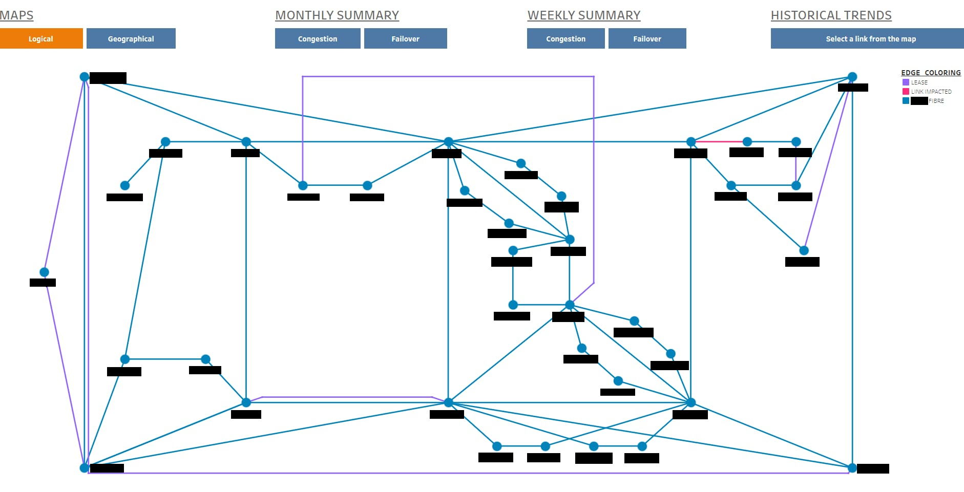
Network Logical View
For example, the following dashboard presents a more interactive version of described maps that even network engineers can utilize for quick insights on network health. This shows a logical view of an IP backbone [hubsite names are hidden for privacy purposes.] Realtime information such as end-points and interfaces, bandwidth avialble and current utilization are shown when hovering over links. The map also allows to select a link (i.e. mouse click) and display historical trend for bandwidth and traffic carried on the given link (to be discussed later.)
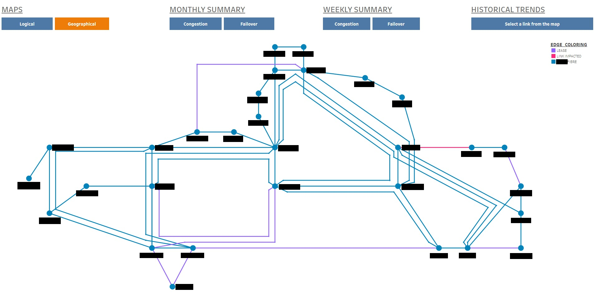
Network Geographical View
The same network is represented below, but from a geographic perspective. This allows network engineers to quickly identify when and where circuits are sharing fibers. Other functionalities are the same as for the logical view, and again router names are blured for privacy purposes.
Ex 2. Congestion and Failover Reports
Other dashboards comprise congestion and failover tables, historical trends, and resource availability reports, equipping network engineers with tools assisting in traffic monitoring and capacity planning activities.
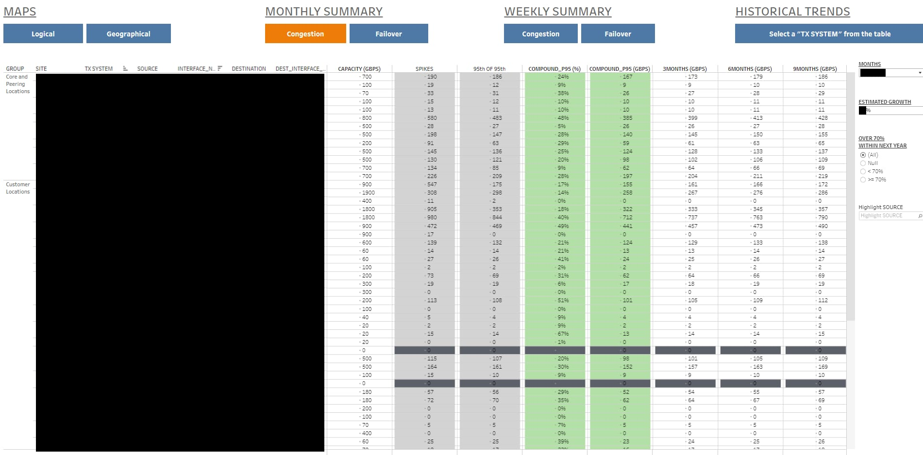
Congestion Table
Another key functionality for this dashboard’s family is monthly/weekly congestion table. One column lists all logical links; for each of them, it indicates end-routers and interfaces, bandwidth for the logical link, current traffic aggregation (from various statistical perspectives), and forecats from 3 months up to 5 years using compound 95th percentile and estimated yearly growth. [Link and router names are not displayed for privacy purposes.]
Color codes are used to differentiate between aggregation techniques, and to highlight links that are already over 80% and also 100% utlization. Radio-buttons allow to filter on links that are under or over 70% utlization. There are other filters available to modify growth rate and focus on links originating at certain (geographic) regions if needed. Per default, the dashboard opens the most recent report but previous months/weeks are available for selection the scrolldown menu. Similar to previous maps, it is possible to select any link and display historical traffic trend for the given link.
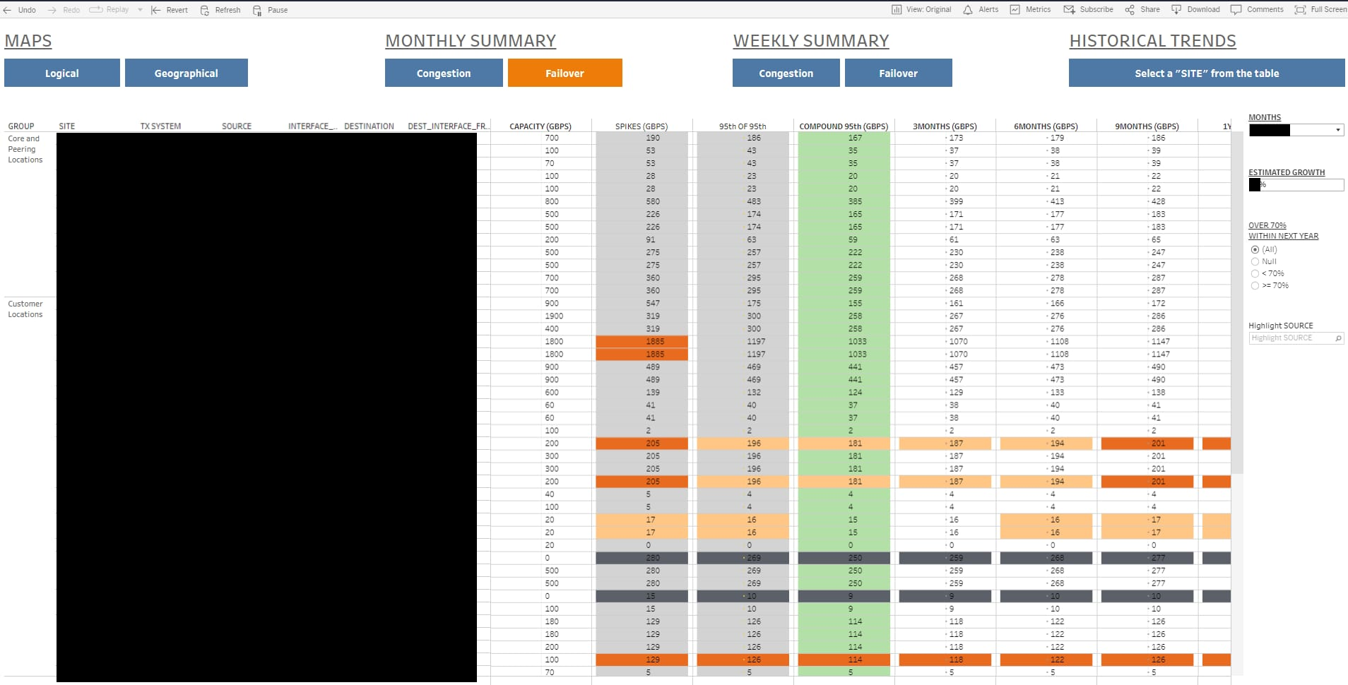
Failover Table
This dashboard is similar to the previous one under the difference that links are bundled in pairs of primary and secondary paths. Subsequently, traffic utilization is evaluated for the sum on both links, simulating the events of failure and checking whether there is enough failover capacity on the surviving link. Again, one can select a pair of links and display historical trends for their sum of traffic vs bandwidth available on each of the links. [As before, link and router names are not displayed for privacy purposes.]
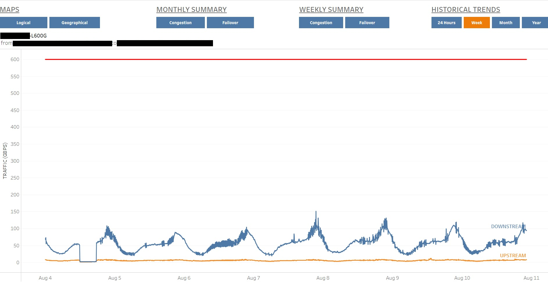
Historical Trends
As previously indicated, it is possible to mouse-click on a link either on logical/geographical map or on congestion/failover tables, and display historical trends. The menu on top of each dashboard facilitates navigation. As shown below the user can choose to display traffic and bandwidth for past 24 hours, 7 days, one month or a year. The following screenshot provides an example showing traffic trend for one logical link within previous seven days; it is possible to get exact numbers and other valuable information [hidden for privacy purposes] upon mouse-overing plots.
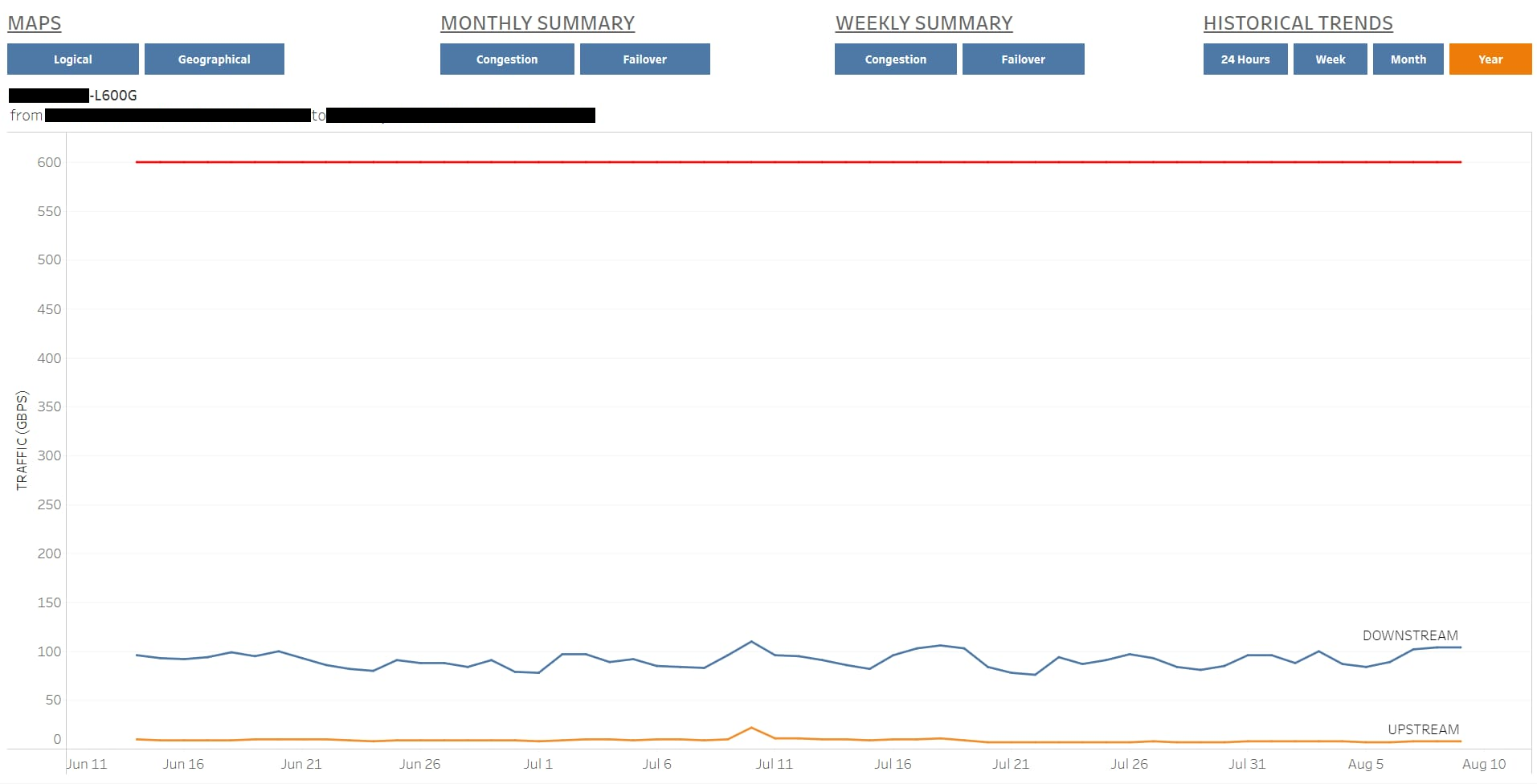
Here is another example for the same link, but this time historical trend covers a wider period of time.
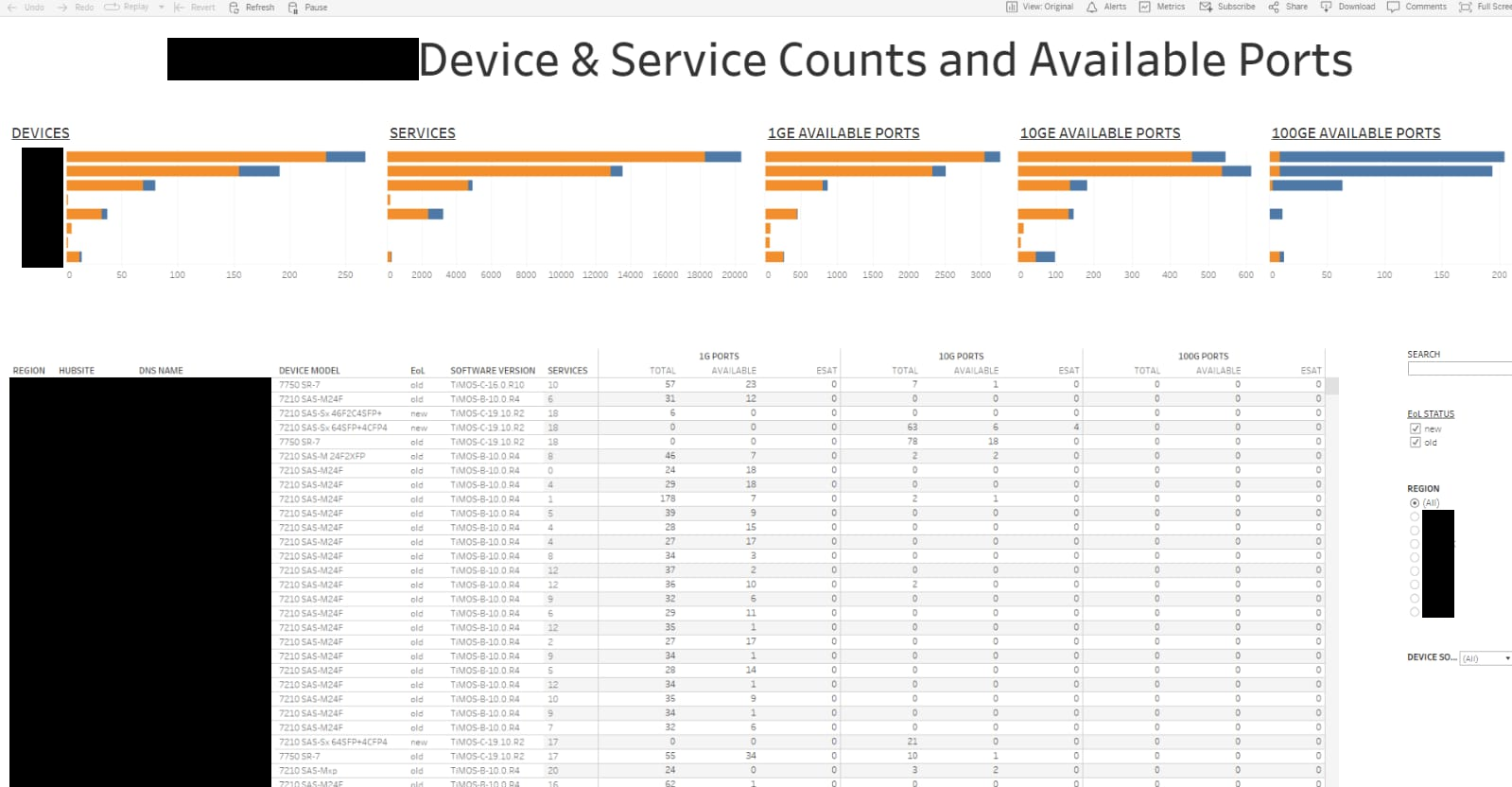
Ex 3. Devices & Ports Tracking
This final example is to retrieve the number of devices at every hubsite; one also counts services and ports (total vs. unused) on devices. Such a port availability report can help to better anticipate shortage of ports and plan for new purchases and power/space requirements, which might be challenging in some hubsites. This report also covers software versions and device models, which are valuable information during migration and code upgrades. [Hubsites and real counts are not disclosed here for privacy purposes.]
Getting In Touch
Would you like to chat about the portfolio, work opportunities or collaboration, reach out at diane.onguetou@gmail.com